BOB Squeezy
Design evolution of the Swedish breakfast icon
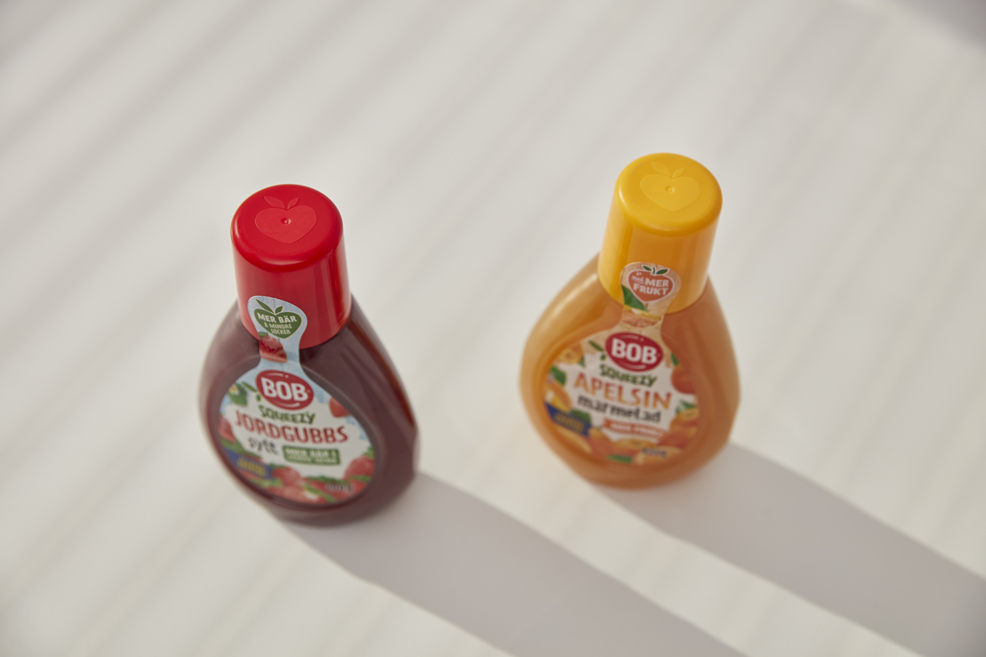
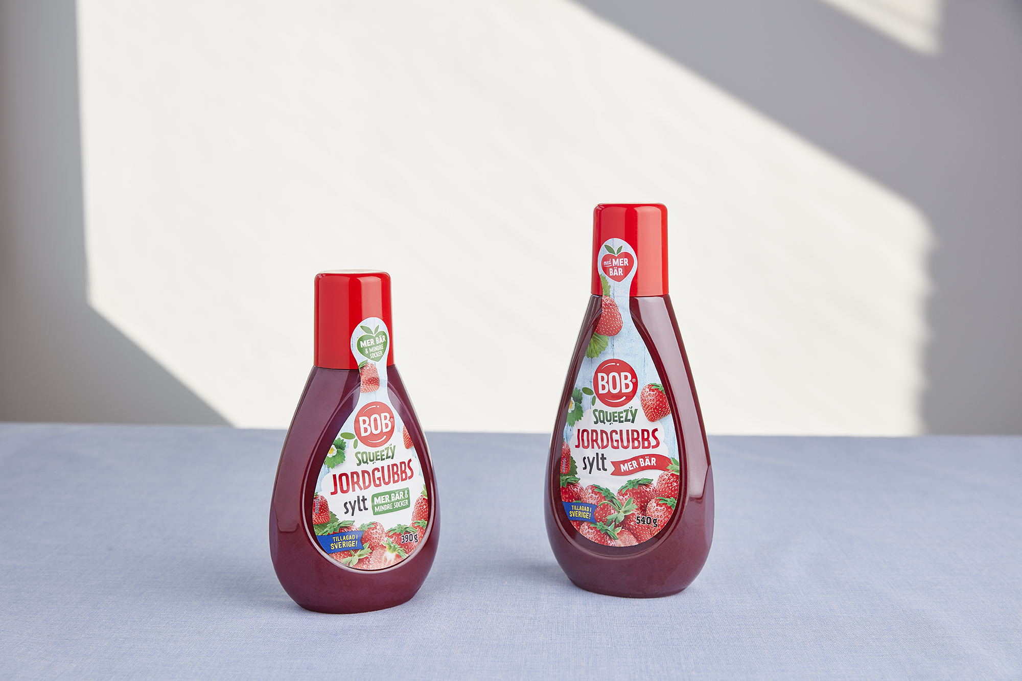
BOB Squeezy is Sweden’s most beloved jam, and it has been boiled and packed in a factory in Tollarp in southern Sweden since the 1940s. We were engaged in design vitalization of the iconic BOB Squeezy bottle, which now comes with more berries and less sugar. The bottle is practical and easy to use, even for small children. With the small spout, you can easily decorate a sandwich or create smileys on a pancake, and customers appreciate the re-sealable design solution.
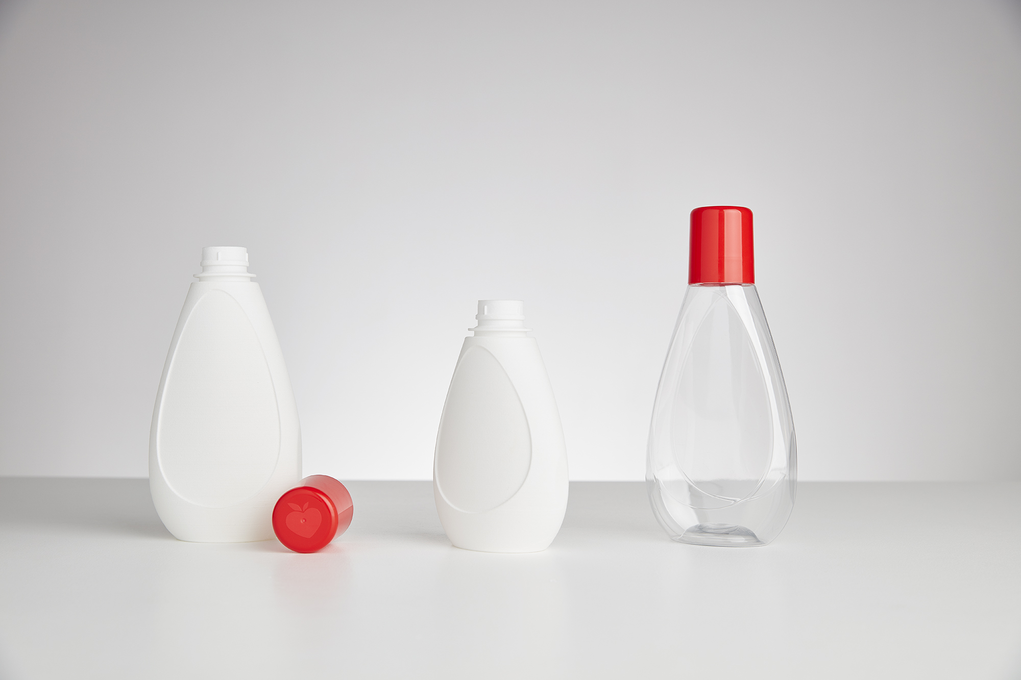
Design process: Through continuous interactions with consumers during the project, it was clear that people love the product. Therefore, our changes needed to maintain the ease of recognition. We saw an opportunity to soften the expression of the bottle, to emphasize the friendly and positive BOB look. The outer contour of the bottle was redesigned with a more harmonic curve. The drop-shaped label surface gives the product a more characteristic look, harmonizing with the outer contour of the bottle while also giving the bottle more rigidity. Additionally, we redesigned the shape of the label into a softer double-drop, providing an extra space for brand elements on the top part of the label. The top surface of the cap was given an embossed treatment, emphasizing the iconic BOB “heart-leaf”.
Implementation: The update was not just an aesthetic one. We also needed to alter the shape to improve the stability of the production line, as bottles were falling off the conveyor belt and the production had several stops every hour. The new bottle was given a lowered center of gravity and supporting surfaces to make the production more efficient. The new bottle was launched in February 2018.
Client: Orkla Foods
Team: Kristina de Verdier, Jonas Lundin